Hospitality · Arnav Harmony Farm
Arnav Harmony Farm: one destination, several ways to visit
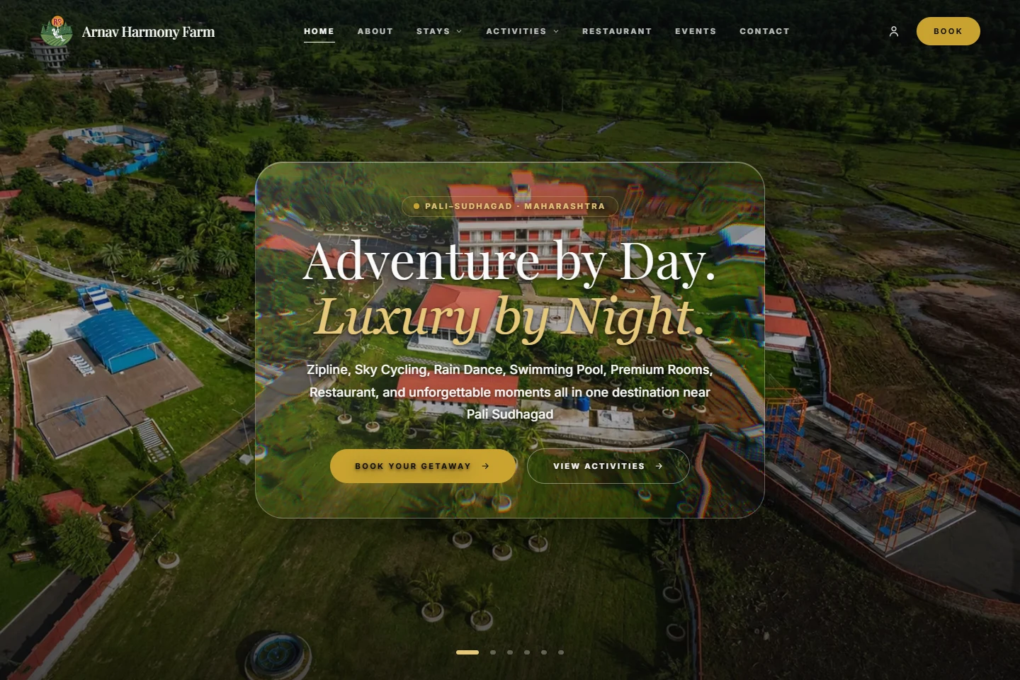
Arnav Harmony Farm is a stay and adventure destination in Pali, Sudhagad, Maharashtra. My contribution was website development. The public website brings several types of visit into one experience.
- Project
- Arnav Harmony Farm
- Contribution
- Website development
- Focus
- Stay comparison · Activity discovery · Visit planning
A destination is more than a room listing
A visitor planning an overnight stay, a family looking for a day out, and a group arranging an event need different information. A hospitality website has to reveal those paths without making the destination feel like several unrelated businesses.
This is the useful design problem in the Arnav project: show what is available, help a visitor choose a type of visit, and keep the route to planning visible as the details become more specific.
Make the main visitor paths recognisable
The public site separates stays, activities, the restaurant and events in its navigation. The homepage links to accommodation details, activity information and a booking route, with a separate contact path for group visits.
Accommodation information covers rooms, suites and a villa. The stays page presents guest-count, meal-plan and day-type controls alongside room information and rate tables. These are useful comparison points because choosing a stay involves more than selecting a photograph.
- Stay information supports overnight planning.
- Activity information gives day visitors a distinct route.
- Group-visit links lead towards a conversation about a different kind of booking.
Carry the detail into the planning stage
The activities page presents experiences including a zipline, sky cycling, high ropes, the pool and rain dance. It also distinguishes included experiences from a chargeable bonfire option.
The public booking screen separates stay choices, guest details, and review into distinct stages. A stay summary sits alongside the planning interface. This case study describes the visible booking interface; a completed reservation is a separate operational step.
For the visitor, the important connection is between discovery and preparation. A person who has just compared accommodation needs a recognisable next step, while a group organiser may need to discuss requirements rather than follow the same path.
The development lesson
Hospitality content works best when the next decision is clear at each level. The homepage introduces the destination; dedicated pages hold comparison detail; the booking and contact routes support different types of enquiry.
The website is a useful example of structuring a varied offering around visitor intent. The same principle applies to a resort, an activity venue or a retreat: keep the shared identity, then give each visit type enough information of its own.
- Keep overview pages concise and link to the relevant planning detail.
- Place practical comparisons near the options they describe.
- Distinguish a standard booking path from a group or event conversation.
Explore the public website
Follow the routes described in this walkthrough. External links open in a new tab.
YOUR NEXT PROJECT
Building a hospitality website?
Tell me what visitors can book, the choices they need to compare, and when a personal conversation is the right next step.